

The Art Of The Tour
The Art Of The Tour
A peek at the design and look of my upcoming summer tour.

There are oh so many challenges in being an unknown artist touring across the country. Perhaps the greatest though, is anonymity. As I head out on the road, almost no one will know who the hell I am, what I do, or why they should pay attention to me. Simply grabbing the eye of a potential fan is like pulling teeth these days.
This is where my skills as a designer and artist can come into play. While other artists have devoted themselves to short form videos like Tik Tok, I have remained old school. I still believe in the power of the poster and a striking image. The posters and images that I have created to advertise and promote the tour evolved over time into a cohesive vision that represents my aesthetic as well as my songs.
As I set out to design the artwork for the summer tour, I began to work with images of the sheddio that I had created last year for my west coast run which was initially slated for February of 2024. While that tour had to be delayed until this coming Fall, I figured I would begin with that imagery for the summer tour.
As I began to work with the basic pieces of the art I had created for the initial west coast run, I became less enchanted with the overall concept. I liked the pastiche nature of it, but the font became less exciting to me as the days passed and I began to feel the entire design was stale and needed a refresh.
During the last few months, I have become entranced once again with spot color and screen-printing concepts. Instead of allowing myself the limitless options of digital full color, I decided to return to my roots in the world of one and two-color offset printing.
I began looking at a variety of old calendars, magazine ads, and iconography for mid-century companies and their products. I scoured Pinterest, dove into chat rooms and even bought a raft of thrift store magazines and books for ideas and inspiration.
A couple of summers ago, I had the pleasure of visiting Hatch Show Print in Nashville. Hatch is a legendary letterpress operation that has been churning out posters for some of the biggest acts in music for nearly 150 years. Their posters are classic and might even be the exact sort of thing you imagine when someone says the phrase, “show poster”.
Their posters are done with woodblock and handset type. They’re done in one to four colors, with each color requiring a separate pass to lay down the ink. These posters are iconic, classic, and simple. While I didn't seek to replicate the Hatch style, or to even recreate a moveable type look to the imagery for the tour, I did want to evoke the simplicity of the process, and decided to limit myself to a two color approach.
I’ve long believed that limitations in artwork are a positive force. In locking myself down to two colors, I would have to be judicious about the way I used type, imagery, and the color itself to make the most of the design. Despite working digitally in Photoshop, I imagined that my work would eventually be going to press as a two color job printed in blue and red.
The color scheme was inspired by a variety of ads and propaganda posters using blue and red on an off-color background. Because I was using the two-color offset approach, I wanted to have a Kraft style paper as the sheet in the background for the poster to be “printed” on. I began finding old matchbooks, advertisements and Communist propaganda that all incorporated several of the elements that I was excited about.


Once I had the rules in place, so to speak, I added a distressed vintage paper as my background, and set my two primary colors to a red and blue similar to the images above. Next, it was time to decide on what the actual imagery would be for the poster and the other artwork necessary to promote the tour.
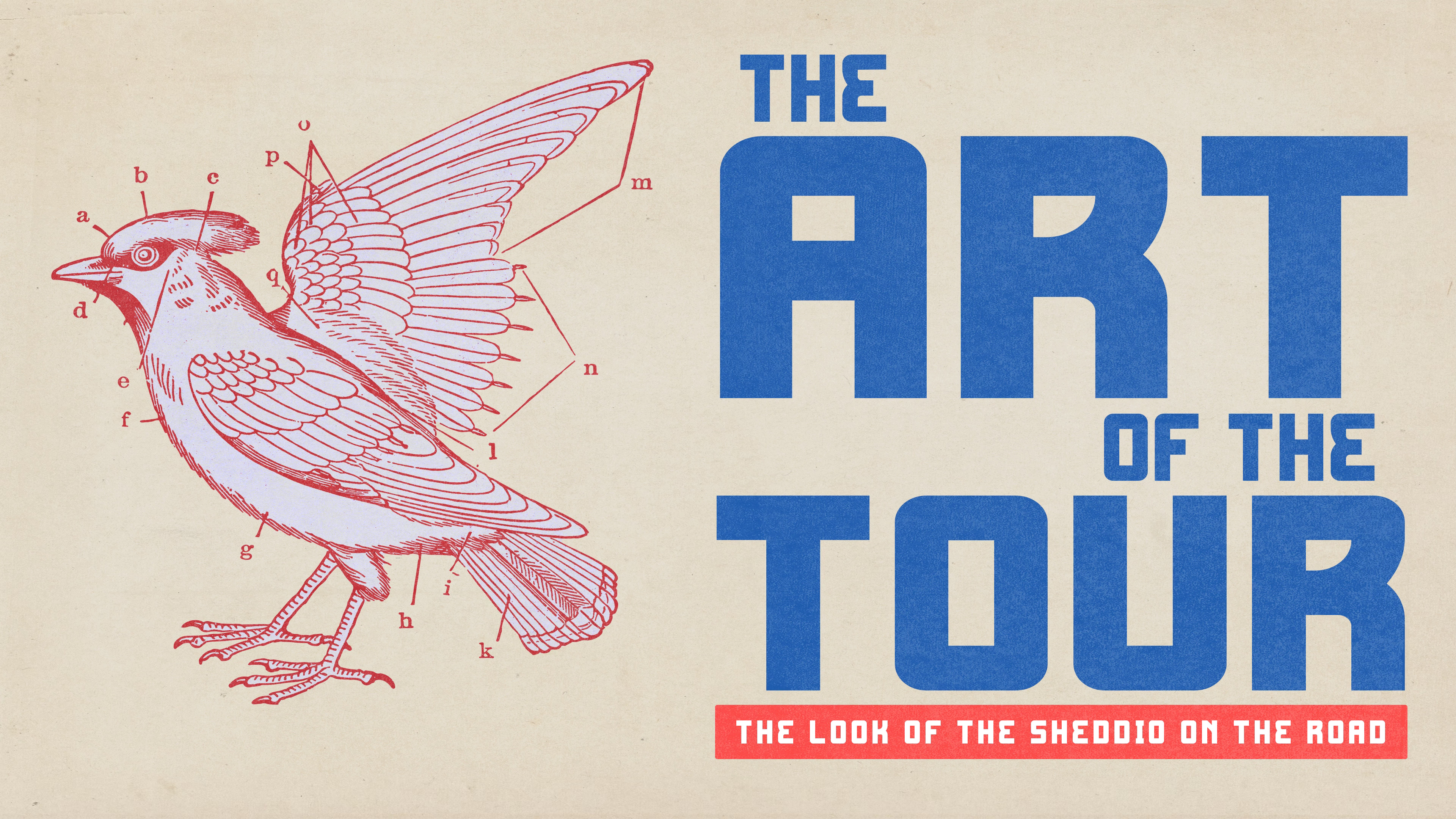
My dear friend Chad Patterson has given me shit for years because I write so many songs about birds. It’s a fair criticism. In three bands and twenty years, I have written and released at least five songs which feature bird names in the title alone. Rightfully, Chad began asking, “What is up with all of the birds in your songs?”
The idea of using a bird and the blue and red color scheme immediately sent me back to the United States Postal Service logo of my youth. I have a soft spot for the logo design of the 60s and 70s, especially those used in public spaces like the USPS. I played around with the USPS bird as the placeholder and then started looking for my own artwork to mold.
 (S) : Clothing, Shoes & Jewelry")
Truthfully, I don’t know the answer to Chad’s question, but the image of a bird as the icon for the tour seemed like a wonderful visual metaphor for traveling around for a month this summer. I began digging for bird iconography in my archive that might fit the bill, but didn't violate the copyright interests of the federal government.
After much trial and error, I found some old folders of archived digital art that included a drawing of a bird with diagraming letters to identify different portions of the bird’s anatomy. I loved the simple line art and the encyclopedic feel to it. I now had the main image, the background, and the conceit of the two color offset approach.
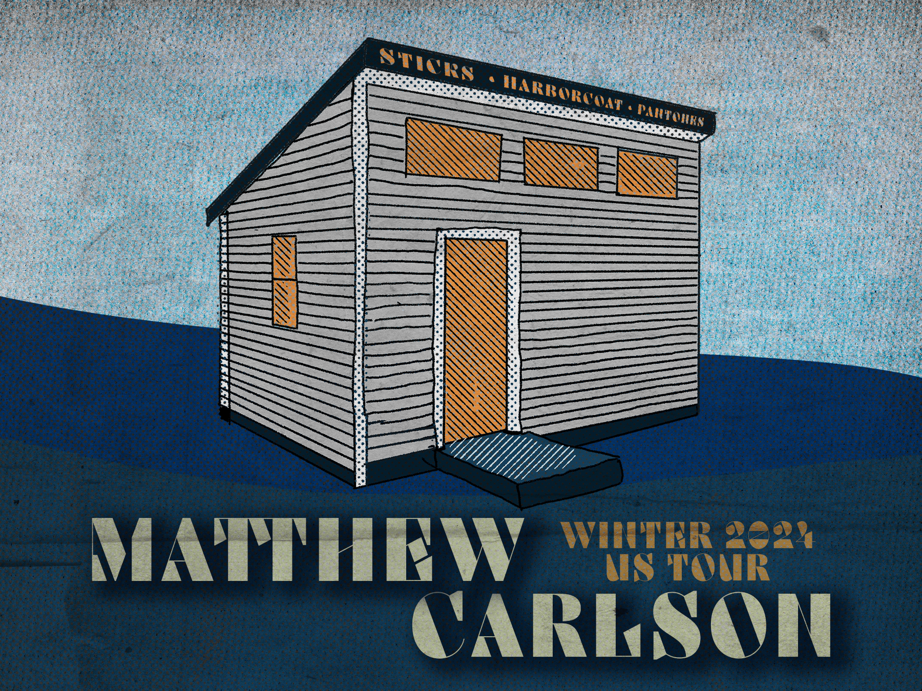
I spent a great deal of time, as I so often do, trying different fonts for the main header section, MATTHEW CARLSON, of the poster. My name and the image of the bird would be the things to attract the attention of viewers. I’d wanted to keep that information interesting, informative, and alluring.
I wanted a font that seemed timeless but didn't feel overused. Futura, the font choice for Wes Anderson credit sequences for more than two decades is a great font, but has seen a great deal of use recently in addition to the employment by the most famed of the Austin auteurs. Helvetica has come to be seen as the business class of font choices, at least in the sans serif realm. Arial is what you use to make a word document, not to attract a possible concert goer.
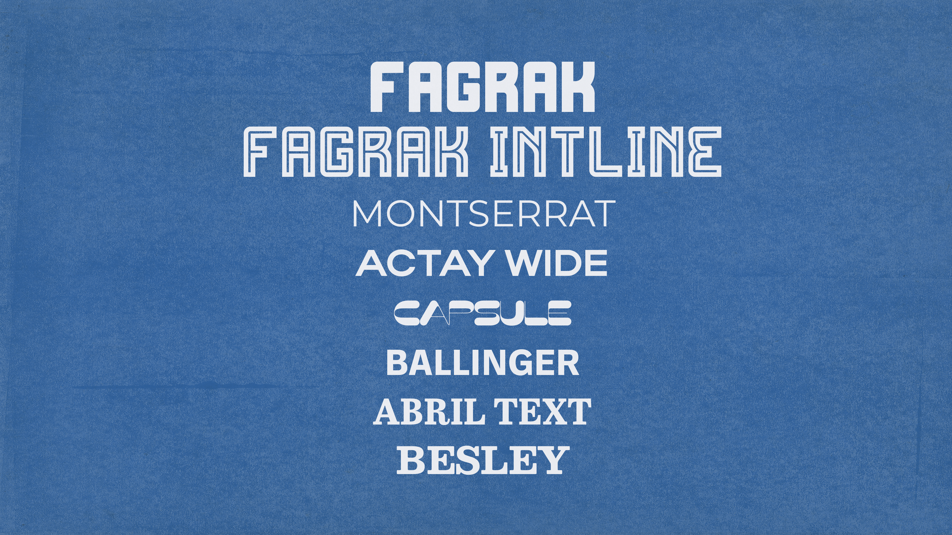
As I dug deeper, I began to look at futuristic fonts, an exploration that was quickly aborted. From there, I looked at clean and classic serifed fonts, but found nothing that grabbed me. As I began to get exasperated, I tried a font called Fagrak that had both a regular version, as well as an inline version. Not only did I like the feel of the font on the poster, the option to use a lined version enhanced my enthusiasm for the typeface. That would afford additional versatility in a series of posters and mages that would use just one typeface (with two variations, the same background, line art, and just two colors.
With all of the pieces and parts together, it was now just a matter of assembly. After a series of failed attempts, I landed on using the bird as the sole focal point, even my name would be secondary to the bird. I began to play with the text for my name and in several versions included warped text around the edges of the bird to create a more cohesive and compact image.
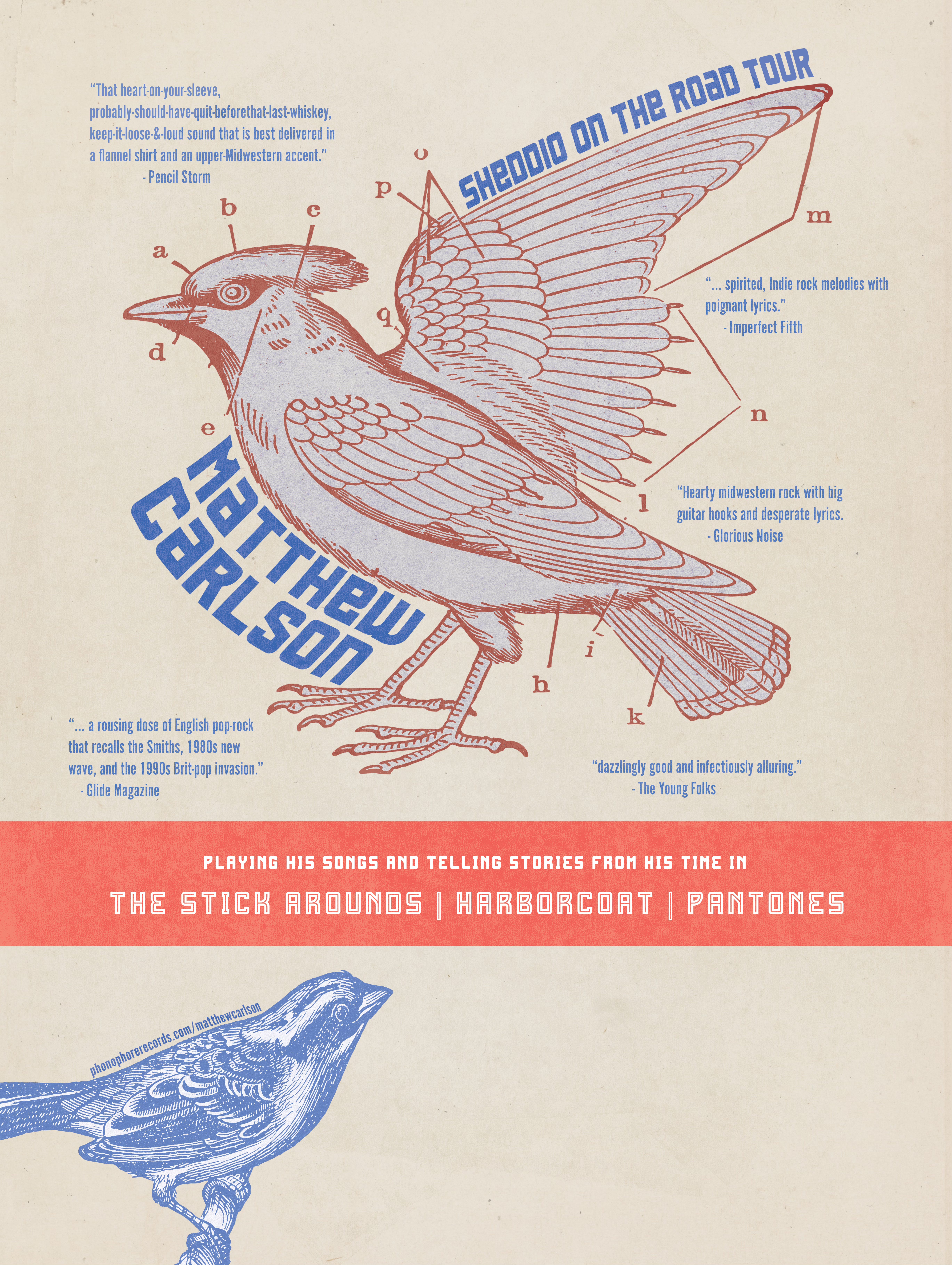
Around the edges of the bird, I added a number of pull quotes from reviews I have received in my career. It’s a nice way to explain to folks a bit what my work sounds like and to broadcast a few critics who have had glowing things to say about it.
Although I am touring solo, I only have songs and records out under the names of my various bands, so I needed to occlude that information as well. I opted for a red banner to separate the poster into a larger upper section and smaller bottom section. In the bottom section, I added blue line art of another bird and tucked my website address along its back. The remainder of the blank area on these can be used to write in the venue, date, and time for each show on the tour.
To give the poster a real world feel, I added a couple of screen pull filters and manipulated them to give a slightly uneven texture to the printed areas. You’ll notice this especially in the red rectangle and in the text for my name. My poster was finished, but my work was far from done.


Now that I had a poster version, I would need to create a landscape version, a square version, individual art for each of the shows to use digitally. The hard part of the design was now largely behind me, but the grunt work of formatting and organizing all of the artwork and assets for the tour was just getting started.
I also wanted to make sure that whatever artwork that I used to make t-shirts and stickers for the tour would be built around the same imagery as the poster and its various digital versions. As I also planned to make some videos to promote the tour as well, I began using this imagery in all of the sheddio sessions to promote the tour and showcase my songs online in video form.
In the end, I am really thrilled with the look and feel of this design and its various incarnations. I’ve even taken the two color approach and applied to the new artwork I am doing for the west coast tour that I have planned for the Fall. Hope you enjoyed this peek behind the scenes and a look at the artwork for the tour. Super stoked to see y’all on the road.
Cheers,
Matty C